One recent Friday afternoon, Art Chantry, the graphic designer who created a look and style that singularly evoked Seattle’s music scene during the 1990s, was wrapping up a long interview at a downtown Tacoma cafe when he paused for a moment to reflect on his career.
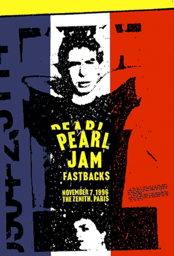
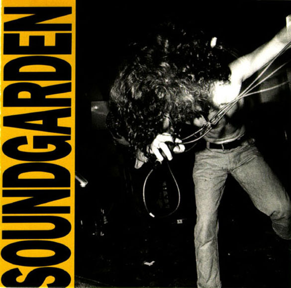
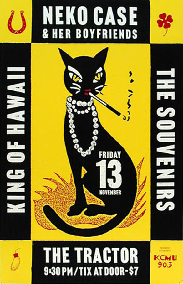
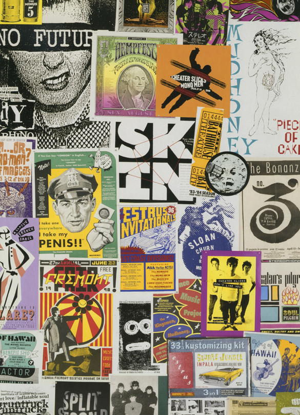
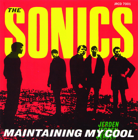
Over the course of two hours, Chantry had covered a lot of ground—growing up in the Parkland neighborhood of Tacoma; moving to Seattle, where he was art director of The Rocket, the influential magazine that covered the Pacific Northwest music scene long before the world turned its attention to it; creating posters or album covers for bands and record labels that included Soundgarden, Pearl Jam, Mudhoney, Neko Case, Presidents of the United States of America, The Fastbacks, Sub Pop, Estrus Records, and Rhino Records; and returning to Tacoma in 2006, where he lives today near the city’s McKinley Hill neighborhood.
“It’s been a fascinating trip,” Chantry, 61, remarked as he touched a color portfolio of his work. “Doing an interview like this, I find myself looking back over it and talking about it in a weird way, but it really has been a weird trip. I wouldn’t trade my career for anybody’s. It hasn’t been a lot of fun all the time. I would have liked to have had better money, but look what I got to do. Isn’t that amazing? Not a lot of people get a chance to do even one thing like this, and I got to do thousands of these.”
Chantry’s work has been on display at the Rock and Roll Hall of Fame, the Smithsonian, Seattle Art Museum, and the Museum of Modern Art, but it hasn’t been an easy career. He says he has lived paycheck to paycheck for most of his life. The graphic design world has changed since computers and cheap software were introduced, and Chantry says his services aren’t needed like they were twenty years ago.
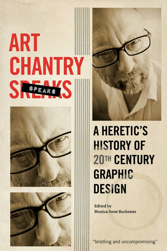
As a result, he has recently branched out into writing. His new book, Art Chantry Speaks: A Heretic’s History of 20th Century Graphic Design (Feral House, $24.95), is a collection of essays that covers the graphic design field—from its language to its notable figures to the tools of the trade—in a way that is irreverent at times, but always informed and entertaining. Do you know about the one-armed sign painter (he lived in Tacoma, by the way)? How about the color-blind graphic designer? Or the nun who designed a postage stamp? These are only a few of the fascinating (and largely overlooked) graphic design notables spotlighted in Chantry’s book.
He also takes on the idea that graphic design is an art form. “It’s not art at all,” he writes. “It’s anthropology and politics and economics—almost anything except art. It is not a muse-driven masterpiece created by a single person in an edition of one. It is mass-produced manipulation and coercion created to maintain the current economic system of exploitation.”
Fantagraphics Bookstore & Gallery in Seattle’s Georgetown neighborhood hosted a book-release party for Chantry in July.
I recently contacted Chantry to see if he would be interested in meeting for an interview. Our interview has been edited for clarity and condensed for publication.


“Tacoma is a really weird place. It’s haunted.”
I grew up here. I moved here when I was ten [years old]. I was born in Seattle. I lived there until my family broke up and then we moved down here. I spent my teenage years in Tacoma.
Tacoma is a really weird place. It’s haunted. I used to collect Tacoma short stories. They used to be little articles in the back of Seattle newspapers and Tacoma newspapers. There would be a little paragraph and it would be a true-crime story of some bizarre thing that would always have this twist, O. Henry ending. I had hundreds of these stories. Tacoma always has weird, twisted angles to its stories that don’t quite fit in anywhere else except Tacoma.
I graduated from high school in 1972, right at the tail end of the Hippie era, and it was before punk happened. I was part of that little lost space in between where we didn’t have a damn thing to do and no music to listen to. I thought I was going to get drafted, but all of a sudden the draft was lifted. What am I going to do now?
Tacoma, at that point, was really something. At that point, Tacoma was Murder Capital USA for a year there. Real proud of that. I was out cruising in the middle of that. I grew up in Parkland. I’m a Parkland kid. That should tell you everything right there. Parkland had the highest crime and murder rate in Tacoma. That meant I grew up in the toughest neighborhood in the United States for a year there. I got stories that will turn your hair white. You get other old Tacoma guys—Parkland guys—in a room and get to telling stories. My friends and I have cleared rooms with our stories. What we did and how we lived and what it was like. That was very formative into my thinking, as well.
“Tacoma has got real folks. I can actually survive and understand this town.”
I went to [Pacific Lutheran University] for a year. I went to Fort Steilacoom—now Pierce College—for a year after that. Then I went to Western [Washington University] for a couple years. Then I moved to Seattle for a couple years. I moved to London for a year. I came back with fifty bucks in my pocket and no place to live. I started from scratch. I spent the next twenty-five years building this [points to his portfolio].
In the year 2000, my girlfriend was head-hunted by an outfit in St. Louis. She moved to St. Louis and I just moved with her. I couldn’t even find it on a map. But I just had to get out of Seattle. It was just killing me. Too expensive. At the time, you couldn’t live in your studio. You had to have a place to live and a place to work. You couldn’t combine them. So the problem with that was that even back then it was really expensive. Over the years, I had wriggled out really cheap studio and apartment rent. But if either one of them went away, I would have been out on the street. I was that close to the edge at the height of grunge, with everybody working in the style I helped create. I just basically pulled up stakes and moved to St. Louis, which was like—everything that Seattle is and was, St. Louis was exactly the opposite. I just wasn’t ready for that one. I just failed miserably in St. Louis.
After about six years, I came back here broke and with no place to live and started from scratch. But this time I moved to Tacoma, where I know the people better. Seattle has become a city of strangers. A city of hustlers. Tacoma has got real folks. I can actually survive and understand this town. Seattle, I just don’t even get it anymore.
“He had become the greatest sign painter in Tacoma’s history with only one functioning arm. Think about that.”
One of the greatest sign painters was from Tacoma. He just died maybe about five years ago. He was an amazing guy. I met him. He was in his eighties and he looked like he had a stroke because half his body was paralyzed. He had a weepy eye and drooling mouth. Only one arm worked. Then I found out that he had been like that since he was nineteen. He was hit by a train when he was nineteen. He had become the greatest sign painter in Tacoma’s history with only one functioning arm. Think about that.
I also know that he was the sign painter for the mob in Tacoma. You know about Tacoma and the mob, right? It’s one hell of a history. According to legend, the Saint Valentine’s Day Massacre hitmen cooled off in Tacoma. It goes way back. Tacoma’s history is really marvelous that way. Really good. They don’t talk about it much because it’s so distasteful.
He was a good man. He was a good guy. He was not a mobster. He was just a sign painter doing jobs that people hired him to do and [the mob] was one of his more interesting clients.
“Generally speaking, I don’t like mural art. But Tacoma’s got some good ones.”
The death of the Graffiti Garage [in downtown Tacoma], that’s one of those things where it was such a wonderful asset and it was such a great cushion because it absorbed all those graffiti artists from the streets. It gave them a place to work. But then one or two shop owners complained bitterly enough because they thought it looked messy. They closed it down and basically the graffiti kids went to war. The town is [expletive] up again with bad graffiti. They are attacking some of these murals that people spent all this time on. Generally speaking, I don’t like mural art. But Tacoma’s got some good ones. Chris Sharp and his mural with the umbrellas—that was attacked. That would not have happened if that one shop owner didn’t complain about the Graffiti Garage.
There are a lot of attempts to do interesting artwork in Tacoma. I think [Dale] Chihuly has been a real mixed blessing. He has kickstarted a lot of stuff, but it has always been about him. That’s really too bad. There’s a hell of a lot of other interesting stuff in this town that just doesn’t get the attention it needs to. But isn’t that the way it always is?
I’m a big booster of the Warhol Tacoma Dome idea because I think that will make this city famous in ways that nobody can anticipate. Can you imagine driving down I-5—you’re not from here—and you drive past that sucker? It would make Tacoma seem like some kind of brilliant place, like these are some of the smartest people in the world.


“I have learned how to design a voice that I can use to speak with and tell this information in a fun and anecdotal way.”
Computers have pretty much killed off freelance graphic design. People can spend less money buying a computer and a program, spending two weeks with it, and just doing it themselves. How am I supposed to compete with that? I mean, the only thing I’ve got is my name. There’s nothing else that is really all that special. That’s just kind of the reality of the situation.
So I began to realize I was going to have to branch out a little bit. I thought I might be able to teach myself how to write. I started sitting down every day at the computer. I would get on Facebook, which was something I had just discovered—I didn’t really understand it very well—and I would find something around my studio, scan it, and then write about why I thought it was cool, what was interesting about it. Basically, I wanted to learn how to do that in an interesting way that people would find amusing. Over the next two-and-a-half years and several thousand essays later, I was approached by a publisher who said, “Let’s do a book out of these.” That’s essentially what the book is.
I have learned how to design a voice that I can use to speak with and tell this information in a fun and anecdotal way that people have responded to. The result is this book.
“I feel like I became a voice for the disenfranchised, for the outliers, for the outsider.”
Throughout my time studying graphic design, I was presented with a particular history—a narrative—that I always thought was kind of stilted and strange because it dealt so much with fine art and not really about advertising and the “low end” of the spectrum. There was this long history and long dialogue and really beautiful interaction that has been going on around culture for hundreds of years, and we’ve only recently started to use the term “graphic design” to describe it. It’s only been in the last twenty or thirty years that even a history of graphic design has even been attempted. It’s all a new phenomena that we just noticed, but it’s been there since cave paintings.
As I spent a lot of time dealing with the fine design culture—because that’s the high end of my industry, my business—I’ve always been treated as an outsider by them because I have always been presenting this style and this dialogue that comes out of subculture—punk, as an example; grunge, as another example—and I’m presenting it into the mainstream. I always kind of keep one foot in the mainstream, in the fine design culture, and one foot in the street, or the subcultures. In a weird way, because of my weird position and because of my interests, and because of the design language that I practiced, I became a voice for the other side of the coin. I feel like I became a voice for the disenfranchised, for the outliers, for the outsider, that really, I think, is actually the true mainstream dialogue of our graphic design language in this culture.
When I present this book and I call it a heretic’s history of graphic design, which wasn’t my term—my publisher came up with that, but I love it—I’m presenting the other side of the coin. I am saying, “There is this other history that we need to pay attention to and do it seriously.” I feel like I am trying to present this vital beast, this still bleeding carcass, and say, “Look, this really is real and you need to pay attention to this.”
“If I don’t have a client, I’ve got nothing to say.”
I’m not an artist. I’m being forced to become an artist. I studied art. I know all about art. I have a degree in art. I chose to work in graphic design because I saw that as the only viable medium worthy of working in because the whole definition of art has changed so many times that it has kind of reached an end point. Art shifted and went to graphic design probably since Pop.
I think [my work] looks weird framed. It’s supposed to be on a wall stapled and taped and stained. Seeing it in a museum framed . . . you know what museums do? They won’t collect posters raw. They have to be ‘artified.’ They treat them to take the acid out of the paper and then they mount them on canvas and then they display that. It makes it look like a painting now, doesn’t it? I think that’s just so strange. But that’s what they do. They can’t even deal with them as posters. They have to treat them as mounted canvas artwork.
[Being an artist has] just never been something that I have been interested in. I’ve never really done images for myself. I just never really follow my muse. If I don’t have a client, I’ve got nothing to say. I mean, look at what I do. I do assemblage. That means I find stuff. That’s what I do. That’s the basic function of graphic design. I mean, I don’t sit down and invent the letter “a” every time I use the letter “a.” I don’t invent the color yellow from scratch. When I use yellow, I’m trying to say something. Yellow means something. Some of these decisions are made instinctively. Sometimes they are made cynically. Sometimes they are used very manipulatively. That is what I am putting together.
“I’m blamed for creating ‘grunge graphics.’ That’s supposed to be my fault.”
Every client is different. They all have differences. When a client walks in the door, you have no idea what you could end up doing. It could be going in a million different directions. It’s never dull. Some say, “Make me a great poster that looks cool.” Some say, “This is what I’m about and I want to reflect my inner feelings.” Other people will say, “My girlfriend is an artist and I want you to take her painting and make a cover out of it.” It can be anything—”Here’s a photograph of my dog. Make a tattoo.” Those are the worst kind of clients. What you really want is someone that will collaborate and work out ideas and themes over a longer term. Sometimes I get to do that.
Some of [the bands] I helped create their image. Sometimes they didn’t even know I was doing it because the imagery for their record covers and posters reflected the way I saw them and they slowly turned into that image. They saw that and they saw what I saw in themselves and they slowly became those things. That’s when it was really the coolest—when you were working with some of these bands and labels and you were helping to brand and define entire genres.
I’m blamed for creating “grunge graphics.” That’s supposed to be my fault. What I was doing was simply that process where I am trying to help define these people in the way I saw them in their culture and their environment and in their personal art. Sometimes that doesn’t work very well. Sometimes it works beautifully.
When you get to a certain level, everything is a one-off. They never really stick with a client or the designer over a long period of time. Very rarely do they do it. When they do, you really notice it. The Grateful Dead and Stanley Mouse Miller. His artwork became part of their identity. But when you are working with an average band and they come to you and say, “We want a record cover, make it look like the music,” you’re not going to have a whole lot of time to work over many projects to help the band define themselves. They are already self-defined, for better or worse.
What really got interesting in Seattle is that it wasn’t very often that I worked specifically with a band over a long period of time. I worked with the labels. I would design for a specific label. Sometimes I would design for the entire label. Other times I would just do occasional things here and there, like Sub Pop, but I was always incorporating these kinds of thoughts to try and steer and direct the client toward success. My dedication was always toward the project, not to the client specifically, because sometimes the client didn’t really know what they were doing.
“There were more graphic designers than you could shake a stick at.”
It was a heady time. It was a lot of fun and I did some spectacular work, even if I do say so myself. But I don’t want to do that [expletive] again. It just about killed me.
When the whole grunge phenomena and “Seattle Scene” happened, everybody moved there to try and cash in. Same for the artists. There were more graphic designers than you could shake a stick at. I couldn’t get the work anymore. One, I had trained all my competition. When I moved to Seattle, I couldn’t get arrested. So what I did was I created my own market and I trained others on how to make their work look like mine. I did that largely through The Rocket and my own business and teaching classes. These people would go out and do graphic design that looked like my stuff. When that happened, all of a sudden my stuff had a market and I could sell stuff because people didn’t think it looked weird. It fit in. That’s how I was able to find work at all in Seattle. As time went on, and this style grew and became The Rocket and became Sub Pop and became grunge and all this other stuff, the media frenzy came to town and they all wanted that “grunge look.” People looked around and said, “You want to talk to Chantry.” They look over at me and say, “That old guy? No, we want that young, hip look.” They would hire my assistant.
My prime earning years lasted about six months. By the time I moved away from Seattle, I hadn’t had any work from Seattle in five years. That was the peak of grunge. No one would hire me to do grunge because I was too old [laughing]. That’s success. It worked. It worked good! It put me out of business.
“This giant steam roller of sharks feeding on Seattle just came day after day after day after day.”
The Rocket stuff was a long time ago. It was so weird. When you look at those grunge years as a giant spinning wagon wheel, we were close enough to the hub to be able to toss a rock out there into the pond and watch the little waves become big crashing tsunamis on the shore. We could throw a joke out there and it could be on the front page of The New York Times a week later. It was a really weird and scary thing to see.
I remember at one point the media just came on top of Seattle. I remember one time in particular, I was just working in my little space up there, it was during deadline, and all of a sudden we had media crews from CBS, Rolling Stone, Christian Science Monitor, an Italian fashion magazine—and there was one other. They all descended on us without invitation and unannounced and were grabbing anybody they could to photograph them and film them and interview them. I ended up being in an Italian fashion magazine. I’ve never seen it. It’s ridiculous. This was what it was like. Every day some [expletive] like this was going on. This giant steam roller of sharks feeding on Seattle just came day after day after day after day. How you dealt with that would make the difference of whether you lived or died. That was very scary to watch.
When a culture explosion happens and you are kind of in the middle of it—let’s just say when people started dying I decided I had to get out. A lot of people died because of that. It was a really weird thing to watch up close. I feel lucky to have been that close to a culture explosion like that. That would have been like being in the Haight in 1966 or something, or London in 1964. Being able to see that up close and personal—but I don’t ever want to look at that again. It was ugly.


Todd Matthews is editor of the Tacoma Daily Index, an award-winning journalist, and the author of several books. His journalism is collected online at wahmee.com.
